NewsGator RSS
Overview
Whilst I’m not new to RSS/ATOM I have only recently started using an RSS Reader/Aggregator/Catcher/what ever you want to call them. RSS is one of the latest developments to use XML standards to deliver content using a subscription model. The RSS can contain anything from text to multimedia. Podcast is an excellent example of how it works but today I will be discussing RSS news reader from NewsGator.
Background
While RSS has been around for years now and ATOM arriving on the scene I have yet to believe in such methods of reading because almost all feeds that I would use only delivers cut down synopses of each article. This means I would see the title and a short description of the article and to read the full article I have to click on a link to load the web page containing the article. To me this just breaks the user experience as RSS is fairly plainly formatted but it worked for reading. When you click on the link to read the full article the actual site loads up with full of colour, images and adverts.
People may argue that they won’t get as much visits/hits on their original website. Well the RSS content is pulled from the original site and people have to go there to subscribe to it (most of the time). Now people might say they won’t get any clicks on their adverts… I mean sponsors. I do not see the problem with embedding the banners in the RSS feeds itself. RSS does allow this! Then there’s the argument for mobile devices or low bandwidth users would want a smaller version for faster download. Well most feeds currently that I use are cut down versions. I don’t see why web developers can’t include both. The full feed should display a summary for it’s first paragraph any ways.
I only started to use an RSS reader when I got my iPhone 3G. It was handy and cached (the summary at least) of articles from the sites I regularly visit. It saved a lot of time from loading the full site which could take a while when I’m on the go and reduced to EDGE or GSM. Since then it has rubbed of on the desktop.
I used NetNewsWire on the iPhone which was created by NewsGator. NewsGator provide an online service similar to Google Reader where you can access your feeds online. The reason I chose NewsGator service over Google was because they had their own RSS readers.
NewsGator Online Reader
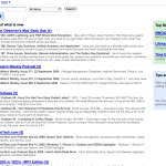
NewsGator’s website looks similar to Google Reader where your subscriptions are on the left hand side with the main pane where the news is displayed in the middle. On the right is a column for recommendations.
I personally prefer the look of NewsGator because it’s clear with no coloured boxes all over the place however I do find the font size to be a tad small.
Both sites use strong or bold font face to highlight unread articles with a leading bracket displaying the number of unread items. Other similarities include tagging feature, email / share the article and function to mark the item as read or unread. Both sites offer different display options from list view to summary.
Google does have some cool statistics showing your reading habits as well as the ability to “star” things. NewsGator has a similar feature that allows you to attach the news article to your clippings. The best feature of Google Reader is it’s built in player. This means you can listen to a podcast from within the reader itself.
NetNewsWire (iPhone)
NetNewsWire is an iPhone app from NewsGator I have used it for a while now. When I first used it, it had few problems. Over time it has had updates and broke more things than it fixed. The current version is doing fairly well. It’s at the point where it looks like a production quality software. Unfortunately they have moved the settings to the iPhone settings page so in order to change anything you have to quit the application, navigate your pages to the settings, open settings and select NetNewsWire. This is very bad but once you have the settings done you would rarely visit it. It’s still no excuse for not having a link in the application.
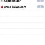
The application supports badges. Although it does not refresh your RSS feeds when the application is running it does display the number of unread items if you do not read all of them. There is the option to turn this off.
The app can load the full article in the app itself. It looks like an embedded version of Safari but it does not support the accelerometer.
The iPhone version also doesn’t have any other display or filter options. You can’t even re-mark read items as unread. The feeds are always listed in alphabetical.
Considering the power of the iPhone I believe there is much more room for improvement yet it’s still usable and they have ironed out the bugs that I can see so far.
FeedDemon (Windows)
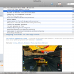
FeedDemon has an Outlook feel to it. The subscribed feeds are on the left hand bar where your mail folders are normally displayed and the middle/right pane where the list of emails would be displayed is where the news items are.
The feed list uses a tree node with the ability to add custom folders/parent nodes for you to sort your feeds. Feeds with unread items are highlighted in bold and a bracket at the end of the feed name displays the number of unread items. The feed list pane is collapsible. Clicking on any of the child notes will display the RSS feed in the middle pane.
To read more you have to click on the title of the post or click the “read more” button usually displayed at the bottom of the description. This opens the web page with the article within FeedDemon itself.
FeedDemon has a neat function which allows you to watch for key words. You can add words to look for and simple search expressions like to look in the title and / or the description of the post, match case, whole word and / or all key words. These watch lists are executed every time the reader refreshes the feeds.
The feed items are sorted in chronological order with each post filed by days. The “Mark all items as read” button only marks the news under that day as read where as on the Mac it marks everything as read. I prefer the Mac way as you may see multiple days on one page! Also the button is in the main pane itself instead of the toolbar. This means the button disappears from the screen whilst you scroll through the news. Once you have looked at / opened all your news items you have to scroll to the top to mark all your unread items. There is a keyboard shortcut to do this.
FeedDemon does list a “Feeds I Pay the Most Attention To” and “Feeds I Pay the Least Attention To”. This can be accessed by clicking on the root node / subscriptions folder. I’m not sure how it calculates this whether you have to click on the article itself to be counted as read or loading the full article via the feed or how often feeds post things but it does seem quite accurate.
Instead of cool third bar on the right side like the Mac, FeedDemon uses tabbed browsing. Whilst this has done wonders for web browsers FeedDemon shows how not to implement tabbed browsing. You must have one tab open but the tab bar doesn’t show till you have more than one tab.
This would normally by for your feed list however you can open articles within this tab. What tends to happen is whilst an article loads, I click on another feed to look at other unread items. Of course if you don’t open up a new tab your currently loading article will turn into your feed listing! Not only that, the tab close button is on the right and not on all the tabs. I suppose this is preference but it should have the option.
The different views in FeedDemon are very obscure. I use the Folder view but changing the view to Feed View does nothing but add an overlay over the feed icons like you get a small arrow on shortcut icons in Windows.
There is no node in the tree where it display all the news that are unread from all the feeds like the Mac client. This is very of putting as I have to click on all the tree nodes that have unread news items instead of getting them all listed in the middle pane.
NetNewsWire (Mac)
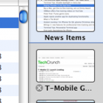
The Mac NetNewsWire RSS reader is similar to the Windows version with a few exceptions. The Mac has a third bar on the right which displays the web page of the news articles you went on to read the full article. It’s good because it lists them in thumbnail view so you can see a preview of the page. It also caches the page so it doesn’t have to load again and allows you to go back to another web page or back to the feed list whilst it’s loading. The bar only appears if you have visited a site otherwise it’s hidden allowing maximum viewing space. There is also the option to open the links in the background. but I have found it not to work like the Windows reader.
The Mac client also supports Growl notifications.
The font size is again a bit small. The reader has the option to change this.
For some odd reason NetNewsWire defaults it’s feed checking to every four hours. To me this is a long time to refresh news. Again a simple change in the preference will sort it out but it doesn’t help improve the usability.
Summary
All the readers by NewsGator are very good. They are fairly mature and stable. The service just works for text based RSS but for podcast support Google seems to be one up with it’s built in player.
The service provides a nice way to read the news and know which one’s you have read across all the supported platforms. Each reader has the pros and cons with the iPhone app being the most limited but it’s also the most recent out of all of them.
It’s a shame there is no Linux client. I’m always surprised by how companies can produce a Mac but no Linux support but I digress.
- Google Reader
- NewsGator Online
- NetNewsWire Mac Version
- NetNewsWire iPhone Version Badge
- NetNewsWire iPhone Version
- FeedDemon
- FeedDemon Most/Least Popular
NewsGator Website
Google Reader
NetNewsWire


